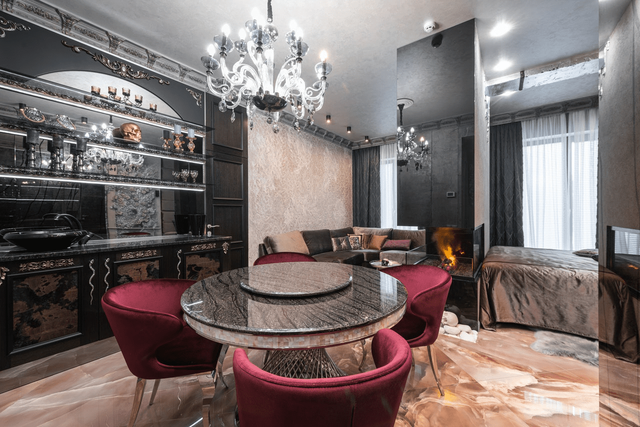
Red, beyond all doubt, is the most striking color in the entire spectrum. Actually you could say that red color is power play when you use it in your home or office. Yet it´s not as easy as putting a red blanket on your sofa or doing a red paint job on your room walls. Make sure you know how to work with colors that go with red very well.
Let us start from color wheel, which is a good place to begin with. There are 3 primary colors, 3 secondary colors, and a great quantity of 6 tertiary colors.
- The key primary colors are red, yellow, and blue.
- The secondary colors are made by mixing the primary colors. The colors are green, orange, and purple.
- The tertiary colors are made from combining the primary and secondary colors. Among these are red-purple, blue-green, red-orange, yellow-green, yellow-orange, and blue-violet.
The most complementary colors are those who stay opposite from one another on the color wheel. For instance, red and green, or blue and yellow.

Image Source: printrunner.com
Why did we start talking about primary colors and the color wheel? Well, we intend to provide you with a fundamental knowledge on the color usage that will definitely give you the best effect. While having great power comes with great responsibility, it is important to have the ability to handle the responsibility of mixing red in an appropriate manner.
Another thing worth mentioning is that you should not pair a dominant color - red, for example - with the other dominant colors. This happens more often when you need the red to be more dominant.
With that said, let's begin with our list of colors that go with red.
What Colors Go With Red?
1. Strawberry + Pink
One of the greatest things in interior design is that we can create something out of nothing and make the impossible, possible. Therefore, before you snigger and pass on to our next color combination, please hear us up.
While putting strawberry and pink colors we can involve Valentine’s day, but there is still more to it, when you look carefully. Moreover, we can use these colors at different places.
Here is an illustration of one of the most captivating places to be, the beautiful pink space. What about that metallic rug makes it worth a second look? You can combine the hyacinth blue and rose pink seamlessly like that. Bringing in dark shades stabilizes these colors so that they do not overwhelm the scene.

Image Source: sightunseen.com
The next thing you have to do is use art to make red and pink work together. Should you not like painting your entire room or bedroom red or pink, then these color combination is just perfect for you.
2. Currant Red + Charcoal
Currant red is a rich shade of red and goes hand-in-hand with some fantastic interior designs. This current red and charcoal combination is a good example.

Image Source: arborand.co
From this picture you can see that there's more charcoal than currants red used in this painting and hence it gives a down-to-earth and cozy look. This does not also mean that you should do it this way. You can try red currant and charcoal or any other blend that suits you.
After all though, charcoal is a mere subdued version of black, but black always looks good with red.
3. White + Red
This minimalist style piece is perfect for any classic color space. And thus, when you have a white interior theme, then you can pop a piece of red painted furniture or art onto it.
On the contrary, you may choose to do it the other way around and use it with a white piece of art or a furniture for an accent color instead. No matter how you choose to execute it, it will certainly have the impact of this legendary combination.

Image Source: homedit.com
4. Maroon + Lime Green
Combining maroon with lime green is just the thing. Do you not remember how we discussed the primary color wheel and the colors on opposite sides of the wheel complement each other the best? Okay, this is one good example of how red and green can go great together.

Image Source: architecturaldigest.com
As well as pairing lime green with maroon, you can pair it with different burgundy hues. Burgundy is dark red-purplish color, and lime green compliments it and hence gives a classy and harmony look.
5. Poppy + Blue
Poppy is an intense, deep reddish-orange that coordinates with darker blues.
This is the color scheme to opt for to give your space a comfortable vibe that will keep the fire chills warmth beyond the winter nights by the fire.

Image Source: sukio.com
Not only do these textures add some comfort, but they also make your dining room or other rooms feel aesthetically balanced.
6. Scarlet + Copper
Scarlet is a really bright red color that includes an orange hint. Contrary to this copper is a more reddish-brown color. It is a shade lighter than brown.
In this case, how do these shades complement each other?

Image Source: thespruce.com
The richness of the color in the scarlet enables the warm undertones in the copper to come through. The colors will be spread all over the room including the ceiling and window for the best results.
7. Burgundy + Olive Green
Here is another instance of when red and green suits each other. If you love holiday themes color, you will love this combination because of the cozy warmth that it oozes.

Image Source: lushome.com
The olive green is not like the lime green above. Instead, it gives a feeling of warmth than other common greens do. What is more, you will see the yellow color of this olive green on the spot if you get close. This is one of the reasons this blend of colors gives your living room the touch of elegance.
8. Rose Red + Jade Green
Looks like green seems to have a firm grip on both of our lists today, doesn't it? Oh...this red rose, and the jade-green combination for the printed pieces is the feature I like the most.

Image Source: mydomaine.com
Hence, you don't need to sprinkle rose-red all over your walls to achieve this effect. Amazingly, you can combine jade green with any varying shades of red and you'll still get that great feeling.
9. Red + Black
Red and black is a strong duo. Imagine entering a living room or office that has this color scheme. Wouldn't you feel the results? If you have smaller children, this might be too daring for them.
Yet, it's worth a try if you live by yourself or work from home. You can have red walls and black pieces of furniture or black walls and red pieces of furniture instead.

Image Source: aliciaconnollydesign.com
The red and black combination provides you with the opportunity to create contrast in your room.
10. Red + Natural Wood
Red and natural wood are similar in the warmth of their undertones, which is why they complement each other. In case your space is full of natural wood but you want a pop of color or the things to be a bit brighter, choose red.
This may be a red couch, a chaise lounge, or a small red chair. This will make a statement and renew the whole kitchen. On the lookout for a couch? Try out these best couches under $1000 for an affordable choice.

Image Source: andreabraundstaging.com
Introducing red into the design may be a great idea when you feel like your space is becoming too monotonous because it can spruce up your mood and begin your home experience afresh.
This is particularly relevant in the case of teleworking. It's very difficult not to get bored by looking at the same things every day and there are just so many ways that you can alter your living room layout.
11. Bright Red + Gold + Seafoam
Seafoam is a shade of green that is identical to trees and blades of grass. So, if you are an outdoor enthusiast and want to add some in-doors magic, you can pair up a bright red with some gold and seafoam.
One of the reasons why this combination is so popular is its classy and elegant effect.

Image Source: communedesign.com
Three colors as shown in this design by Commune Design are effectively mixed with a light turquoise cushion. Doesn't this glow a chilled, homey, and glam vibe?
12. Red + White + Cornflower Blue
This combination makes your space a very relaxed room. Imagine morning in penthouse in a New York style. It doesn't matter if you have a large budget to work on or not you can all still make it work for you.

Image Source: housebeautiful.com
The best thing of all when it comes to having cornflower blue in the scene is that the mood can be changed by changing red shades. On the other hand, if you want your place to be brighter, pick more lively shades of red.
On the contrary, darker shades of red can create the ambiance they prefer by using darker shades of red, such as burgundy or maroon.
13. Red + Amethyst
The one who said purple was the color of royalty was definitely right. Now, mix this royal color with red, and you create a wonder. I mean check out this space. Wouldn't that be like you're being beamed up to some castle in Europe?

Image Source: housebeautiful.com
The red color here brings a spot of color in tune with the amethyst and light violet energies of this apartment. Alternatively, you may decide to add more red to your color scheme if you feel that using one alone is insufficient.
14. Red + White + Yellow
Before you shoot arrows at us, please hear us out. On the surface, this may appear more than what you need but it can enhance areas in your house in ways you may not have thought of.
Such color combination brings a feeling of cozy, happy, and lively environment inside your home or office.

Image Source: home-designing.com
At first sight, it may seem very unlikely, but red + yellow is a mighty duo. This one drips power and impressiveness when you add it a bit gracefully.
If you are a creative artist, this color scheme will be of great help to your imagination. A sunny yellow is associated with the positive, stimulates your creative and is energizing.
15. Red + Brown
Brown is really a good color that you can have on your walls. Yet, it can easily feel mundane if there isn't other vibrant colors in the room.
In this regard, think about putting some red accents everywhere in the room. It can be successful if yours isn't a brown wall but the piece of furniture instead..
You can use the color brown to compensate the redness effect of your red walls.

Image Source: decorilla.com
By playing around with this palette, you can have great outcomes and create a feeling of warmth and coziness in your room. This color combination can also help you avoid the problem of making a cold and big space feel homey.
16. Burgundy + Beige
Beige has a warm undertone to make it pair with burgundy and other warm hues.

Image Source: home-designing.com
The combination of such colors has a majestic and royal touch that can add a charming mood to any place. Whether you live in a family with children or you are living by yourself, do this play of color to see how people will accept the new ambiance.
The warmth and coziness of this palette is a bonus as it makes your home even more inviting. What's even better for a business owner is to make the clients like the waiting areas by using different interior design colors.
17. Poppy + Forest Green
We noticed how well the poppy goes with the darker blue colors. Now, let's go with forest green.

Image Source: dazeyden.com
Forest green is a color that will complement many others, including assorted reds. Try pairing forest green with red fabrics that have a pattern if you are looking for a more textured design.
One example is the one we see in the images above. By the way, solid reds can do work, but print red stuffs will make you feel the boho trend better. You can go on to a few patterned throw pillows and also.
And when they get dirty, you don't have to be worried since there you have this guide of how to clean throw pillows.
Final Thoughts
Do any of these colors look like they would go nicely with red? Now, you will decide which design you will start with.
You can experiment with red as much as you want to create the right impression. Nevertheless, avoid mixing it with other colors since it already outshines them naturally.

