What do you get when you mix light blue and pale green? A beautiful color called turquoise. This bright yet calm color is drawn from the gemstone of the same name. Turquoise gems have been used as holy stones and talismans by Native Americans for thousands of years.
In fact, turquoise is the only gemstone that has an official color named after it.
The turquoise color symbolizes the calm blue and serene waters of the sea. Just as the beige hues of the sandy beach and the turquoise waters complement each other, so do turquoise and neutral shades work together.
Other Colors Related to Turquoise
Turquoise may be confused with other colors, such as cyan, teal, and aqua. While each may be a tint, tone, or shade of the other, you may consider these colors as branches of turquoise.
Cyan has more blue than green and is a lighter shade of turquoise. Cyan is more of a shade of blue than green. In fact, the full name is actually cyan blue.
Teal is a bit darker than turquoise. It is darker and greener. It is more of a shade of green than blue.
Aqua is basically softer cyan and refers to the color of clear water. It is a very slight variation of cyan and is often used interchangeably.
The question of whether a specific color is turquoise, teal, cyan, or aqua, is up to much public speculation. The primary reason is that turquoise is already a color combination, so it will align with colors in the blue spectrum and green.
Knowing the difference will save you the drama of getting the wrong wall paint color or the throw pillows you ordered online.
Turquoise comes in different variations:
- Turquoise blue
- Light turquoise
- Dark turquoise
- Bright turquoise
What Does Turquoise Symbolize?
Turquoise is a versatile color, encompassing green and blue aspects. It represents the growth of green and the tranquility of blue.
Turquoise evokes the following emotions:
- Friendliness
- Happiness
- Free-thinking
- Wisdom
- Tranquility
Colors That Go With Turquoise
Turquoise blends well with grays, neutral shades, and bright colors. You can pair turquoise with complementary colors (opposite in a color wheel). Turquoise also works well with both blue and green; it gives your space a simplistic, versatile angle.
1) Turquoise With White
This is perhaps the softest shade on our list. The two colors, both individually and jointly, are serene and pacifying. While white will portray a minimalist environment, turquoise turns up the volume, but not too much. White is a natural color that goes well with any other color.
The best instance of these two colors in action is making white the main color and using turquoise accents as the focal point.
Image Credits: decoist.com
2) Turquoise With Mustard Yellow
Turquoise goes well with yellow undertones because it is made up of a 6% yellow tone. Mustard yellow is also known as marigold and is a favorite among young adults looking for a unique decor color.
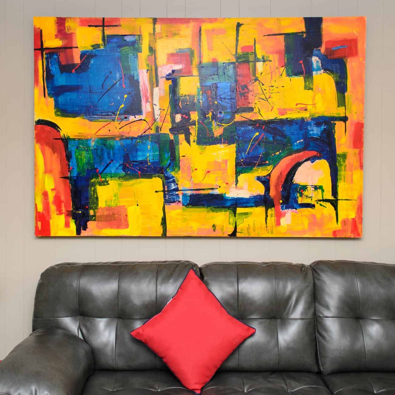
Mustard comes in two varying shades, either dark yellow or light yellow. Lighter shades of mustard yellow will go well with bright and dark turquoise. Mustard yellow can be used in home decoration, such as this abstract art throw pillow.
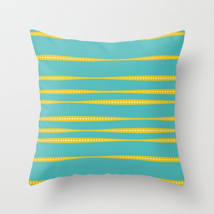
Image Credits: society6.com
Mustard yellow and turquoise give off a chill, hip mood while still being friendly and welcoming in home decor. The secret, as with other color medleys, is to balance the colors; let there be a dominant and subordinate color arrangement. For instance, in the bedroom below, the dominant color is turquoise, while mustard yellow complements it.
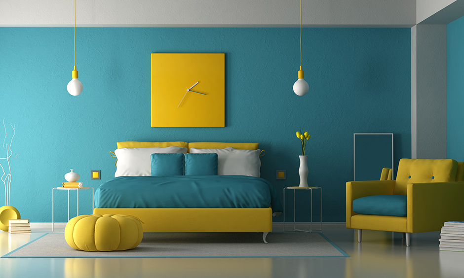
Image Credits: designcafe.com
3) Turquoise With Navy Blue
Navy blue evokes feelings of masculinity and focus. The military has used it for years, and this popularity made it a fully-fledged color that could be used outside of military duties.
Navy blue augurs well with turquoise because both are varying shades of blue. At the same time, turquoise lightens a room, and navy blue tones it down. This is a perfect mix for a theatre room, where you’ll have dark blue walls and bright turquoise throw pillows.
The living room below stands out, yet it is not overly dramatic. Finding decor pieces to add to it is quite easy, as you can brighten up the space with turquoise or darken it a bit. What navy blue does is create a background for brighter colors to shine.
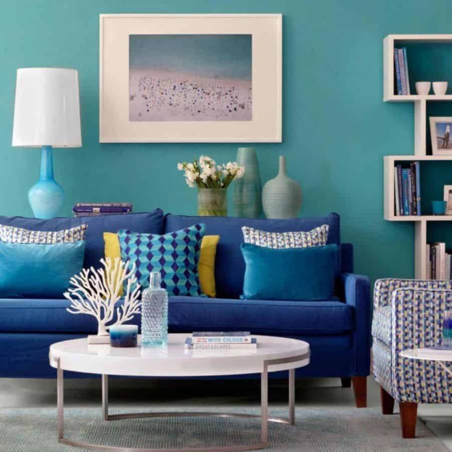
Image Credits: nextluxury.com
4) Turquoise With Pink
The problem with filling your space with bright colors is that they can overwhelm it. The solution is to use lighter hues, like in this bedroom. The colors don’t compete with each other but complement each other.

Image Credits: pinterest.com
However, to add a pop of color and brightness, teenage girls may prefer hot pink and bright turquoise. These two fun colors elicit a cheerful atmosphere. Bright pink is so vibrant that it may swallow the lighter turquoise. You can see how white is added to balance these two striking colors.

Image Credits: decorpad.com
5) Turquoise With Burnt Orange
If you want to liven up your space and emphasize certain aspects, such as couches, or carpets, then this combination is for you. This combination also works well as wedding colors.
The decline of the minimalist culture can explain the sudden rise of burnt orange in recent times. But instead, more people are embracing a more earthy, natural lifestyle, so you don’t expect such desert colors to go anywhere any time soon.
Burnt orange can be used as an accent color for turquoise or vice versa. The effect is stunning. It gives off a desert aura that’s welcoming. In this image, the turquoise chairs and table lamps serve as the perfect turquoise accent choices for this vibrant orange background.
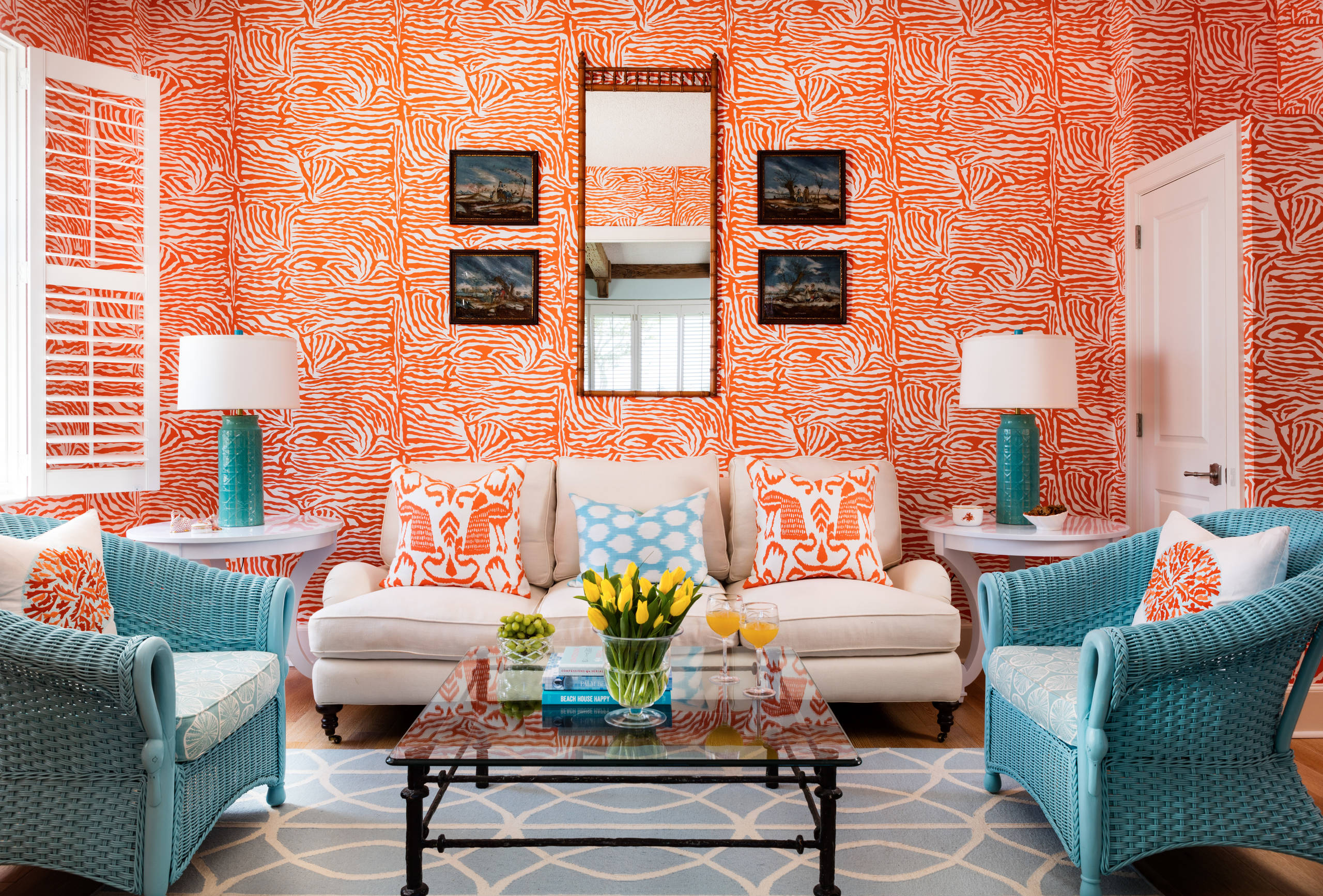
Image Credits: houzz.com
Burnt orange elicits autumn vibes or flames. It’s close to terracotta and amber. What’s certain about this loud and bold color is that it goes well with soft and calm turquoise. This mix gives you a warm, stimulating, yet calm ambiance.
6) Turquoise With Gold
Jewelry containing both turquoise and gold gemstones is a fashion statement everywhere. But more than that, they are a rarity, which makes this color palette even more unique. The gold turquoise necklace below paints a picture of soft elegance.
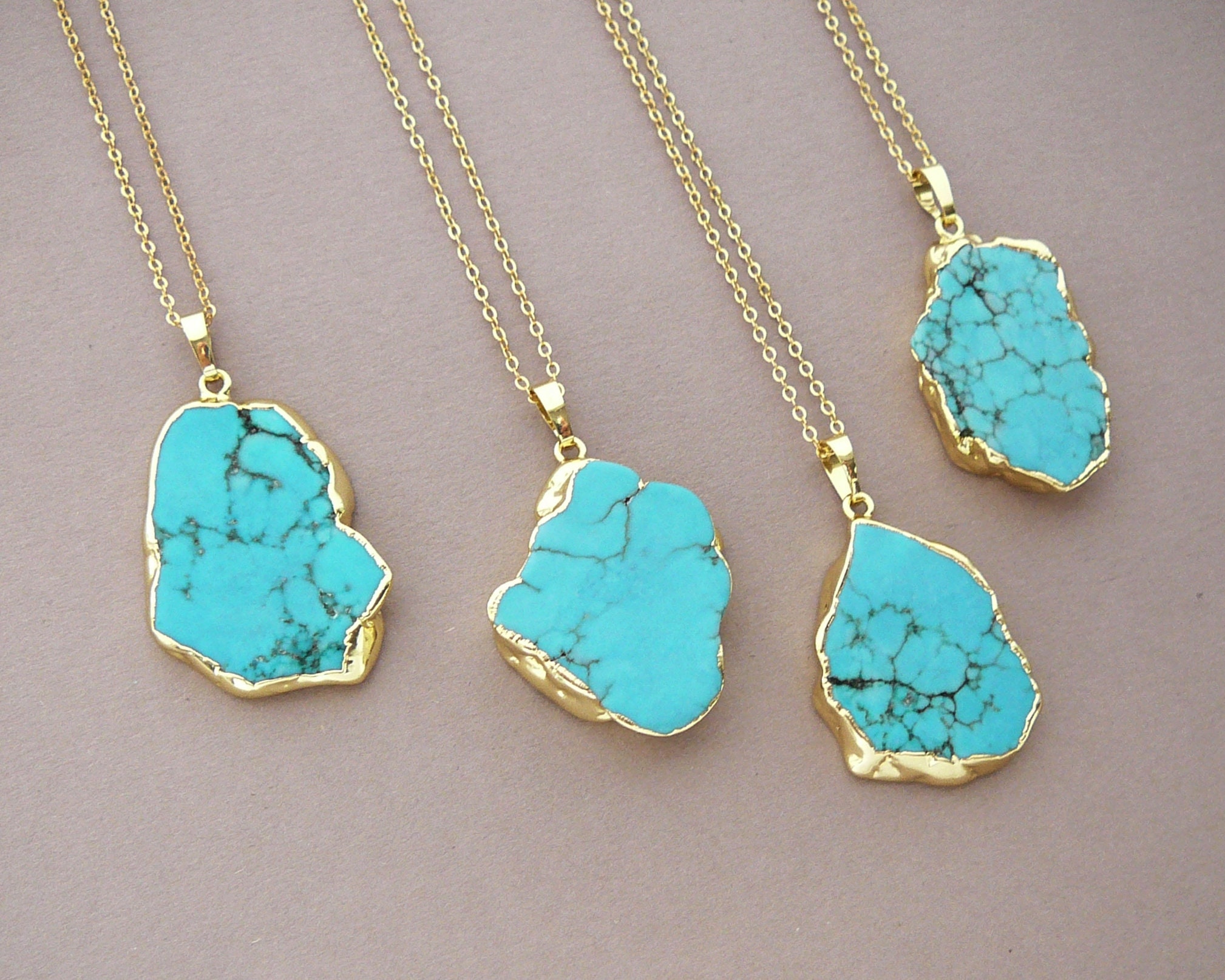
Image Credits: etsy.com
In interior design, blending turquoise and gold accents gives a heavenly, royal energy. However, the two colors also exude sophistication and, sometimes, a Middle-Eastern atmosphere.
Gold makes the room appear airy and natural, while turquoise makes it calm and relaxing. In the living room shown below, you can see how the gold on the mirror edges, chandelier, and decorative pots accentuates the turquoise wall and ceiling. The room looks so sophisticated.
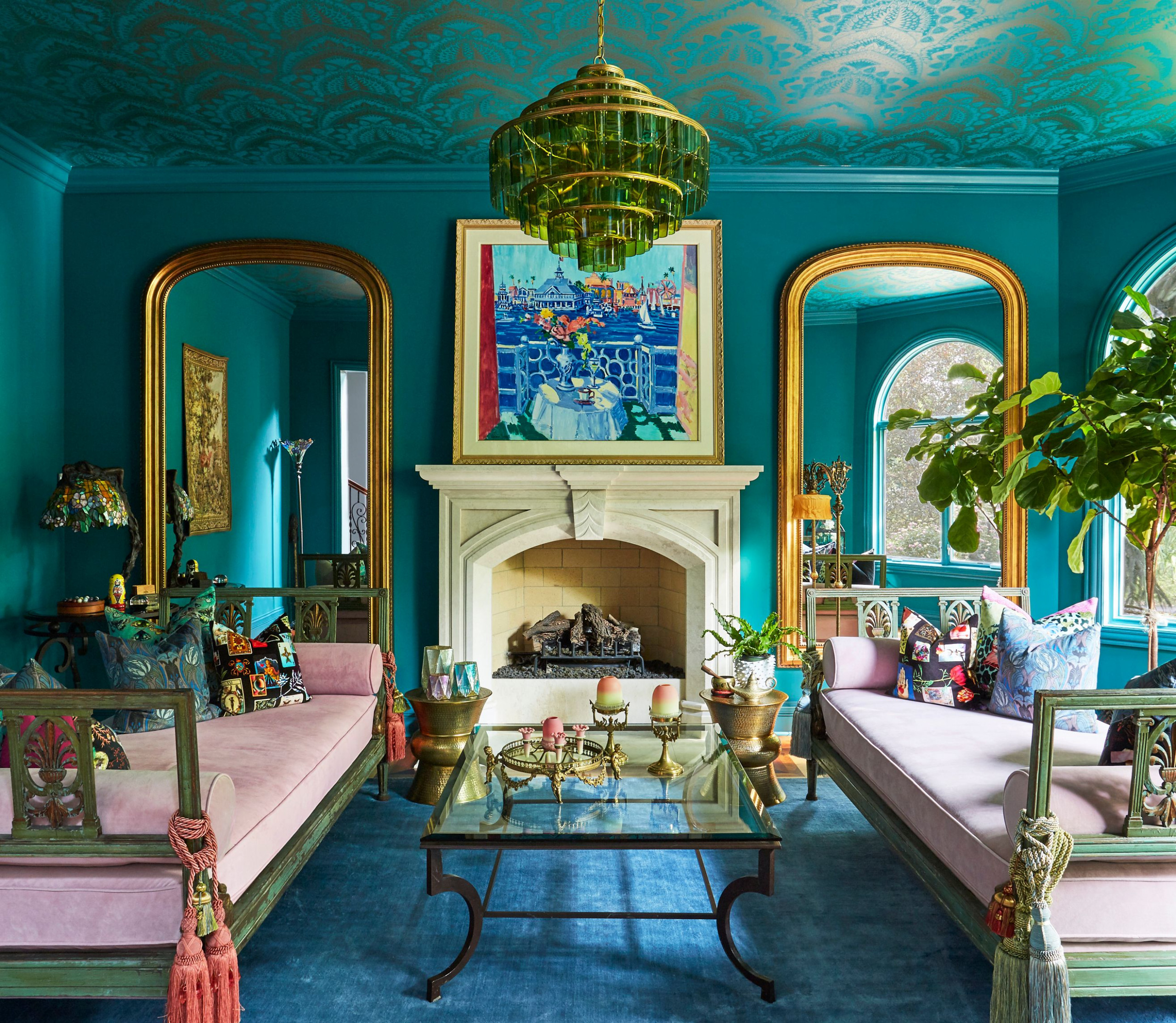
Image Credits: deavita.com
7) Turquoise With Brown
Turquoise pairs nicely with natural wood trim such as brown. The combination elicits organic, calming, and rich tones. Turquoise emboldens the decor but does not diminish the oak hues.
The turquoise wall in this living room softens the visual weight of the brown. Turquoise provides warm tones and serves as a soft spot for the eyes by making the room a bit brighter.
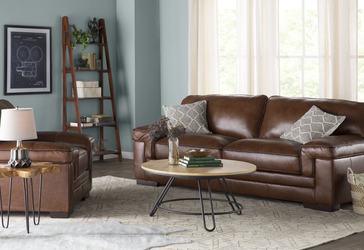
Image Credits: houzz.com
In this other image, you can see how the brown seats and cork floor accentuate the turquoise walls. Notice how the walls are green turquoise; this is a darker turquoise, almost close to teal. White evens out the dark hues produced by both colors.

Image Credits: foter.com
8) Turquoise With Royal Blue
This color combination spells regal majesty. Turquoise will go well with all forms of blue, including deep blue shades. Because they are two shades of blue, they both provide layering, which enhances visual beauty.
Mixing turquoise with different shades of blue will bring a sense of tranquility to a room and trust. It would be best for a therapist’s office or if you intend for your living room to be a safe and inviting space for your family and guests.

Image Credits: pinterest.com
9) Turquoise With Black
Black and white are achromatic colors, meaning that they have no hues. So if it’s black, it’s either black or black. While black has been popularly construed as evil or sad, it has a great sense of mystery that may be appealing.
Black is simple and elegant. Like in this bedroom, you can use black as the main color and turquoise as the accent color. White softens the room a bit but does not take away the joint effect produced by black and turquoise.
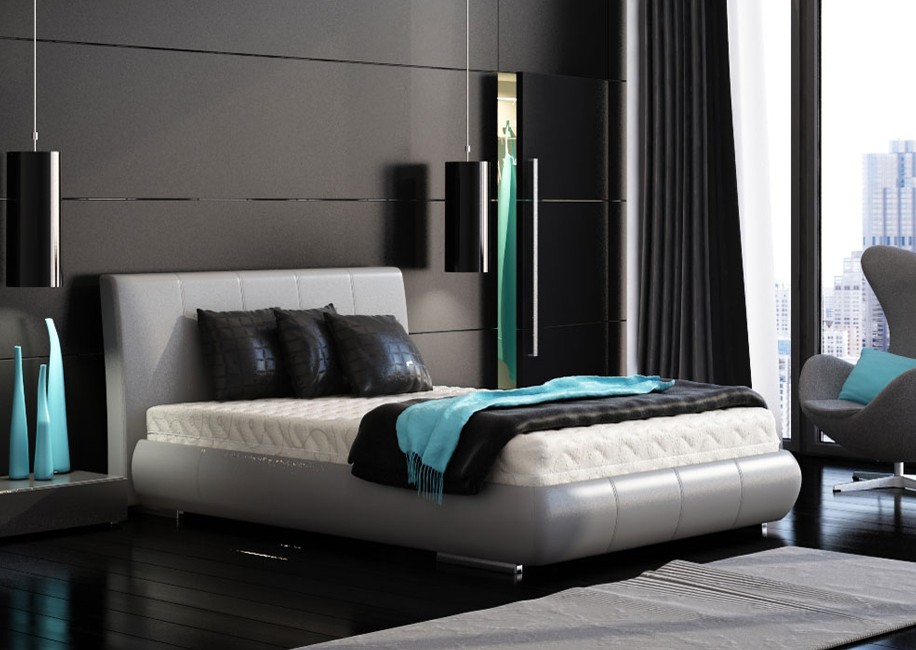
Image Credits: interiordesignideas.com
The 60-30-10 rule is a principal rule in color combinations that recommends that one uses a main color at 60%, a secondary color at 30%, and an accent color at 10%. In the image above, black is the main color; white is the secondary color, and turquoise is the color accent.
10) Turquoise With Grey (or Gray)
Gray is one of the dark colors that go with turquoise quite well. This is because neutral colors go with turquoise and are formed by mixing black and white. It gives any room a contemporary feel, yet sometimes elicits an old-school vibe.
Turquoise reveals clarity and empathy. Grey also evokes balance and neutrality. The turquoise ceiling and seats bring in a welcoming splash of color. Notice that your eyes will be drawn to the turquoise seats first.

Image Credits: houzz.com
11) Turquoise With Lilac
Lilac symbolizes nobility and luxury. It creates a welcoming and relaxing feel. Soft shades of turquoise and lilac evoke sensuality. Lilac is a blend of red and blue, meaning it merges the bold nature of red and the cool nature of blue.
Lilac differs from lavender because lilac has a pink tint, whereas lavender has a blue tint. Lilac also embodies innocence and serenity. It is simply dreamy and spurs calmness when mixed with turquoise.
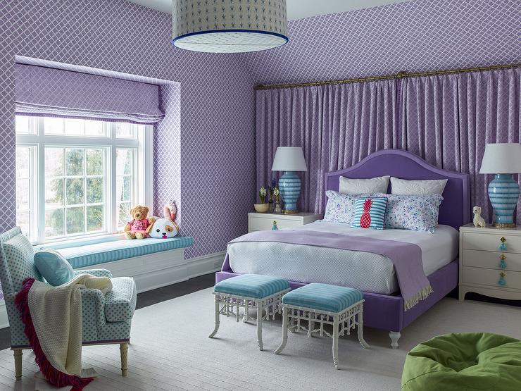
Image Credits: houzz.com
The best thing about the tandem is that no color supersedes the other. Both turquoise and lilac get chances to shine individually. For instance, in the bedroom above, one cannot tell clearly whether the accent color is the turquoise furniture or the lilac drapes. They balance so well.
Frequently Asked Questions (FAQs)
1) Is turquoise more of a blue or green?
Turquoise color comprises 83.5% green and 78.4% blue on the RGB color scheme. Therefore, when turquoise resembles green more, it is teal; if it is closer to blue, it is cyan or aqua.
2) Does turquoise go well with red?
Contrary to popular opinion that turquoise and red are both vibrant colors, they can go well together. Red is a bold color and can be toned down with turquoise. The best shade of red that works well with turquoise is tomato red.
While bright red symbolizes hot passion, mixing it with the color turquoise sort of softens the intensity. So, if you think of pairing turquoise and red, ensure they are a sharp contrast to each other; if hot red, then uses pale turquoise.
3) What color looks best with turquoise?
Turquoise combines well with neutral colors, grays, blues, and greens. It may be used to set off bold colors, especially shades of yellow, pink, and orange.
Be careful when pairing turquoise and brighter shades of bold colors. Turquoise is only a stunning color when balanced well.
4) What furniture color works best with turquoise walls?
Turquoise is a bright color that works well with wood tones. Therefore furniture that retains its natural brownish-beige or reddish hue will work well with turquoise.
You can take your creativity further by using different shades of furniture and light fixtures for each accent wall in your home. White furniture will also work well with turquoise walls.
Featured Image Credits: houzz.com